How WiTuners Help to Predict Wi-Fi Propagation Effects
Does your WLAN give you all of the features that were promised by the manufacturer? Did you get that high data rate that was printed on the box? Probably not. WiFi is such a complex system that the average buyer/deployer/user doesn’t stand a chance of understanding even the basics of what they need to know to keep a WLAN system running optimally.
What Does It All Mean?
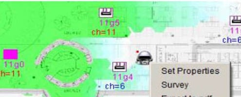
The dark green colors mean strong signals, the pale ones mean weak ones, and no color means that you’re in trouble. In the heat map shown, the wall above the doorway is very lossy and almost no signal gets through to the room above. On the other hand, the wall on the left is semi-transparent and there seems to be plenty of signal in the room to the left. Also, notice that the doorway provides a nice propagation path as well, as the energy “spills out”.
So, you can tinker with the AP placements or fill obvious dead zones by buying and installing an additional AP. And, best of all, WiTuners can optimize the deployment with the click of a single button. You get the right number of APs, and all of the mysterious WLAN configuration settings get suggested to you so that the network will be optimized.
A little more tweaking to make sure the APs are not placed behind heating ducts and so forth, and your network is ready to go. You will be confident that you’ve wrung all of the throughput that is possible out of the APs, your users will be connected, and their quality of service will be high (no sputtering voice calls and fewer jerky YouTubes).
Try this SaaS out at WiTuners. It’s fun to use, models the WLAN in a detailed fashion, and you and your users will be pleased to finally have an optimized WLAN.


Leave a Reply
Want to join the discussion?Feel free to contribute!